Method
The method proposed is to use statistical analysis of time series between your data and the climate/environmental variables.
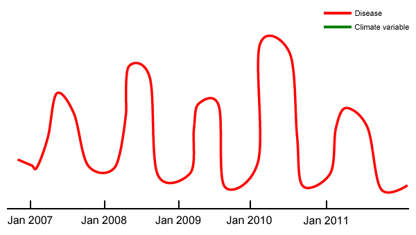
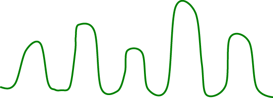
In the above interactive graph, the X axis represents time. The Y axis could represent rainfall in millimeter or temperature in degree Celsius or vegetation index (no unit), etc.
The example above shows seasonality between the disease (red line) and a climate variable (green line). The seasonality between these two might have a lag; move the cursor to show different lags.
For your particular research, the spatial and temporal relationship between your data (red line) and climate/environmental variables (green line) might take on different forms. It is important to remember that, when the relationship between your data and climate/environmental variables shows a seasonality, you must:
- Remove the seasonality and work on anomalies (see Lesson 11).
- Run statistical analysis with different lags (see Lesson 6).